Web Design and Conversion, How Do They Relate?
Web design plays a major role in conversion rates. You want people to quickly and easily discern what you are selling and how to get in touch with you to purchase your products or services. It should have the major information at the ready, yet not be overly complicated to where it becomes off-putting.
Here are some basic ideas that designers follow when thinking about creating a web design that is inviting, engaging, and leads to a high conversion rate.
Above the Fold
The real estate at the top of a web page before scrolling down is known as “above the fold.” This is the make-or-break section of your homepage. It should be uncluttered, be fast loading, have an appealing design, and have an obvious call to action (CTA) form or button. In this section every word, image, CTA, and line of content matters. This is where a the potential customer quickly decides to eliminate your website from his or her interest or move forward to a possible conversion.
Simplify
One of the golden rules of design is simplicity. When there is a lot of competing information, it becomes overly complicated and the eye doesn’t know where to focus first or in which direction the content flows. While it is tempting to try to get as much information in one page as you can, when tested, a dense design is a turn off. Having clear, a concise CTA and menu options will allow people to be pulled in without being overwhelmed. Then, if they do want to more information, they can easily navigate their way to it.
Directional Cues
A potential customer should never have to pause to figure out which column or section to read next or—even more importantly—where to find contact information. Subtle cues, such as arrows built into the design that point to the call to action form or button will help inform readers of the flow and gently move the customer’s eye toward making contact.
Information, even if it comes in the form of images or graphics, should always flow left to right and from up to down.
Clear Call to Action
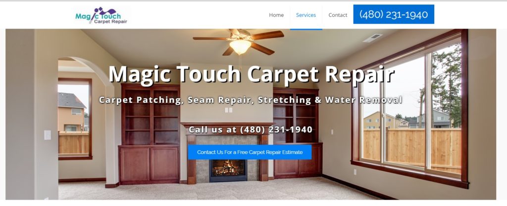
Blocking off the call to action (CTA) buttons in a boarder gives it a clear boundary, making it easy for the browser to pick out from the rest of the text. Encapsulating CTA buttons greatly increases the conversion rate. Below the blue square around the button makes it stand out against the picture behind it. The phone number is also in an easy-to-find, matching blue block.

Fast Loading
Speed is a major consideration for today’s mobile friendly web designs. Not only will a mobile user be put off and move on when a site takes too long to load on a smartphone, it is also penalized by Google for being too slow. Image and video files on a homepage can easily be too large. You want them to be engaging, but not slow-loading. Finding a balance is the key to good web design. Proper image optimization is a must for page load time.
Specific Content
Content should be part of the design, not an afterthought. Your content is your sales pitch. While design features and elements are important to consider, the content should also be detailed and well thought out. It should be specific to your company, your products, and the benefits of what you have to offer. It should also be concise and quickly get to the point. You want web users to be able to figure out who you are and what you do right from the start.
Contrasting Colors
Colors can have many different meanings for different industries. There is no magic bullet. Some of the best designs are those that are simple and have bold contrasting blocks, distinguishing one section from another and complementing one another.
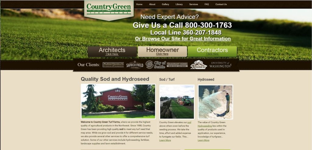
Below you will see the greens and browns create a pleasing contrast and make individual sections stand apart from each other.

Face It
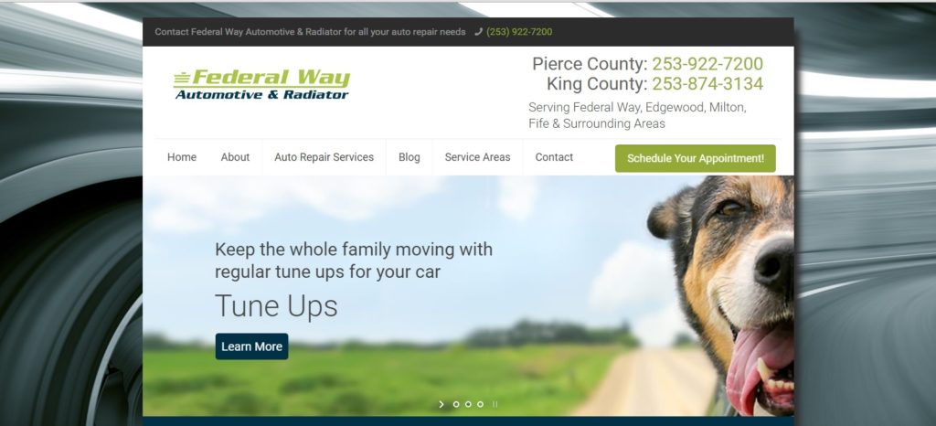
Facial recognition can influence conversion. People like to see other happy people. Even animal faces, when they appear genuinely happy, have been shown to increase conversion. Real life happy faces even convert better than paintings of people’s faces. People see what appears to be a happy customer and their empathetic neurons kick in and make them crave the same experience.
In the example below don’t you just feel the breeze on your face and want to smile along with this guy? Now don’t you want to bring your car in for auto repair from these guys to achieve the same effect?

Web design is as varied as the number of companies out there. Of course, you want them to be personalized and speak to the owners and their branding. There are elements that can improve on the conversion, but they will be different for each specific website. Following these basic guidelines is a great starting point. For more information, contact one of our web developers today.
